 Kaid Benfield Archive
 An in-depth look at location, transportation, and affordability (Part 1: ULI analyzes a metro region)

Posted February 17, 2009 at 1:33PM
Warning: very wonky post coming up.
Last year, I posted a couple of times (here and here) about how the costs of driving turn what one might think are affordable areas to live into expensive ones. The Center for Neighborhood Technology and the Brookings Institution have done amazing work on the issue.
Now we can add the Urban Land Institute, an association of land developers, to the mix. Working with the Center for Housing Policy and with CNT's technical wizardry, ULI's Terwilliger Center for Workforce Housing has produced a remarkable report that examines the issue in depth, using the Washington, DC region as its example. In particular, Beltway Burden: The Combined Cost of Housing and Transportation in the Greater Washington, DC Metropolitan Area (PDF) not only documents in detail the rising cost of transportation generally in the DC area; it also demonstrates quite clearly how sprawling locations add to those costs, because households on the fringe must drive more and own more cars to do so.
The result, for a region that like most has been growing dramatically at its expanding fringe for several decades, is a substantial overall shortage of truly affordable places to live for working families. Compare the two GIS-based maps below:
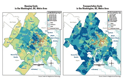
The map on the left depicts the relative costs of housing across the region, by census tract. The map on the right depicts the relative costs of transportation. On both maps, light-colored areas are more affordable. Dark-colored areas are more expensive. Housing costs are highest in the relatively close-in suburbs to the west of DC, taper off as you go farther out, and move into the most affordable categories on the outermost fringe.
Transportation costs, on the other hand, follow a very different and more uniform pattern: they are lowest in the District of Columbia and highest on the fringe. Two notable exceptions, both relatively small on the map, are the sizeable and more self-contained cities of Frederick, Maryland to the northwest of DC and Fredericksburg, Virginia, to the southwest.
While this study focuses on the Washington region, I would expect very similar patterns in most all large metro areas.
Here are a couple of graphs that express the comparison in a different way:
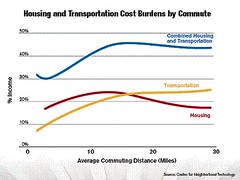
The graph on the left shows how average housing (red), transportation (yellow) and combined housing and transportation costs (blue) - each expressed as a percentage of household income - change with increasing commuting distance distance from DC. At a commuting distance of about 15 miles, transportation costs actually overtake housing costs in their relative claim on household income. The combined housing and transportation costs climb sharply as one moves from central locations up until about those about 15 miles from the center, where they level off but remain high.
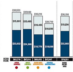
In other words, the more outlying the location, the greater the average household burden, regardless of housing costs. The bar graph on the right confirms the pattern, showing central jurisdictions with the lowest combined costs and outer suburbs with the highest.
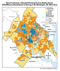
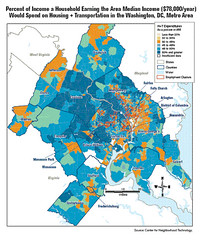
Most dramatic of all, though, may be the change in affordability of locations that takes place when one compares the portion of household income that a household earning the regional average would have to spend just on housing (left; blue areas are the most expensive, yellow the least) with the portion it would have to spend on housing and transportation together (right). Note especially the places that change color:
ULI's press release summarizes the findings neatly:
"Housing located far from transit and employment centers places a heavy financial strain on working families in the Washington, D.C. metropolitan region, according to a new publication . . . Beltway Burden documents the challenges faced by area working families who are forced to 'drive 'till they qualify' for housing, incurring higher transportation costs that eventually erode their housing cost savings. It finds that area families are victim to combined housing and transportation costs that constitute, on average, nearly 47 percent of the area median income . . .
"The report points out that 'we need to use our existing infrastructure more wisely and more intensively.' Public policies are needed to preserve the existing stock of affordable housing in the city and older suburbs. More compact development would make public transit more economically feasible and attract retail and other uses, thus reducing congestion, greenhouse gas emissions and transportation costs, the report says.
"These challenges will only increase with the projected addition of 1.7 million new households over the next 20 years in the region."
As a complement to Beltway Burden, ULI also released the Terwilliger Housing + Transportation Cost Calculator, which provides consumers with up-to-date Washington, D.C. metro area data that they can use to make informed decisions on where to live and work. Developed in partnership with CNT, the calculator allows users to input their current home and work addresses and compare their current housing and transportation costs to the costs they would incur if they chose to change their home and/or work addresses. The calculator can be tweaked in all sorts of ways to reflect more closely one's actual circumstances.
Tomorrow: I run the calculator on my house and the locations of some family members. The results bring these patterns to life. Thanks to my colleague Justin Horner for first alerting me to this study.