 Kaid Benfield Archive
 An in-depth look at location, transportation, and affordability (Part 2: real-world comparisons)

Posted February 18, 2009 at 1:37PM
My wonky post continues . . .
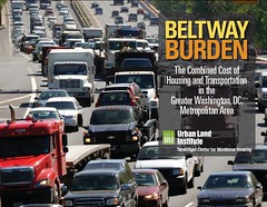
Yesterday I wrote about a remarkable, data-rich new study from the Urban Land Institute (in partnership with the Center for Neighborhood Technology and the Center for Housing Policy) analyzing the impact of location on housing and transportation costs. The study focuses on the metro Washington region, but I would expect very similar patterns in other large metro areas.
 To make a long and detailed story very short, as one goes farther away from the regional center and from jobs, housing may become less expensive, but the significantly higher costs associated with the need to drive may offset the otherwise apparent savings for housing. Although a superficial look at housing prices may make outlying areas seem more affordable, in many cases they are actually more expensive than areas closer to the center.
ULI's site hosts a neat tool called the Terwilliger Housing + Transportation Calculator. (ULI's Terwilliger Center for Workforce Housing is named for benefactor Ronald Terwilliger, chairman of one of the nation's largest developers of residential real estate.) The calculator "provides consumers with up-to-date Washington, DC, metro area cost data that they can use to make informed housing decisions."
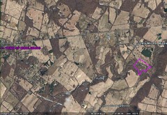
As it turns out, because my wife grew up in this region, we have an extended family representing a variety of locations that allow us to test the calculator. I entered our address plus the zip codes of three other family households, and the calculator helpfully generated this map showing their relative locations:
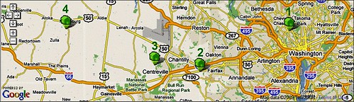
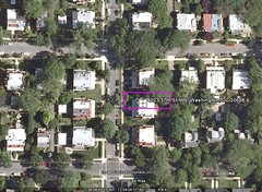
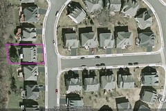
We're house #1, on the far right, in the city of Washington. Google maps says that we are 3.8 miles from the White House in downtown DC. Here's what our location looks like in Google Earth, both close-up and in the larger neighborhood:
The calculator says that our location typically has a two-person household (sounds right, given the mix of singles, empty nesters, and families with small children), with two workers (yep), and two cars (right again). Here are some more data generated by the calculator for the average household where we live:
- Transit access: High
- Household density: Medium
- Job access: High
- Block size: Very small
- Average miles driven per year: 12,722
- Avg. housing costs per year: $27,696
- Avg. transportation costs per year: $12,312
- Avg. combined costs: $40,008 (35% of average income for the neighborhood)
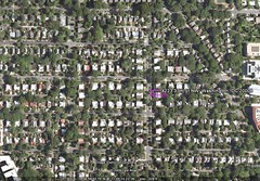
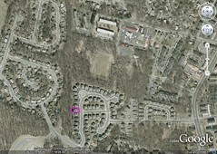
Now let's look at house #2, in a relatively new subdivision in Fairfax City, Virginia. It is located 15.7 miles from the White House. Here's the house and lot in Google Earth, again both close-up and in the neighborhood context:
The calculator says house #2 is in an area typically with three-person households, two workers, and two cars. More data:
- Transit access: Low
- Household density: Very low
- Job access: Low
- Block size: Very low
- Average miles driven per year: 20,172
- Avg. housing costs per year: $33,924
- Avg. transportation costs per year: $16,054
- Avg. combined costs: $49,978 (38% of average income for the neighborhood)
So with little transit, a suburban location, and relatively few nearby jobs, the rate of driving is significantly higher and, consequently, so are transportation costs. Overall, the location is about 25% more expensive than for house #1. Average incomes are higher as a result, so that the burden on typical families living there is higher, but not substantially higher, than for location #1. But it would be priced out of range for many working families.
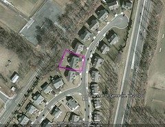
House #3 is in western Fairfax County, 20.0 miles from the White House. It's in a new subdivision in the outer (if ironically named) suburb of Centreville, Virginia. That's Dulles International Airport just to its north on the map above. Here is the actual house in Google Earth:
The calculator says that households in #3's location typically have four people, two workers, and three cars. More from the calculator:
- Transit access: Low
- Household density: Very low
- Job access: Very low
- Block size: Very low
- Average miles driven per year: 23,748
- Avg. housing costs per year: $40,692
- Avg. transportation costs per year: $18,766
- Avg. combined costs: $59,458 (40% of average income for the neighborhood)
The first thing that jumps out is the amount of driving, roughly twice as much as for households in #1's neighborhood. Apart from the financial costs, that means about twice as much time spent in traffic and away from productive activity or recreation. It also helps make location #3 the most expensive by far, well out of range of most working families and placing a significant burden even on the ones that can afford to live there.
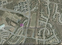
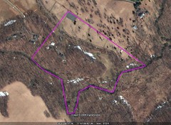
Our last set of relatives in the comparison lives on what I might describe as a gentleman's horse farm of about 40 acres, in Loudoun County, Virginia, a few miles from the town of Middleburg and 35.5 miles from the White House. Since we go out to house #4 often for family occasions, I can confirm the distance and also that it is truly a lovely property, a bit remote for my personal taste but bucolic. Given the size of the property, you have to look hard in the Google Earth image to find the house, but it, two outbuildings and a pool are on the far left of the property:
Because this is still a mostly rural area (though the county is developing quickly not that far away), the demographics change. According to the calculator, the typical household has 3 persons but only one worker, and two cars. Here's the rest:
- Transit access: None
- Household density: Very low
- Job access: Very low
- Block size: Very large
- Average miles driven per year: 21,459
- Avg. housing costs per year: $24,024
- Avg. transportation costs per year: $15,582
- Avg. combined costs: $39,606 (53% of average income for the area)
Now I should quickly mention that the average household in #4's zip code does not get a 40-acre horse farm with a swimming pool for the area's average housing costs. In that sense, house #4 is a bit atypical for its location in a way that the others aren't. 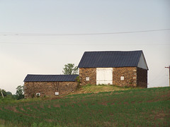 But, leaving that aside, what jumps out for this location is that, given the lower average incomes in the rural area, housing and transportation costs impose a huge burden on those that live there. The rate of driving is the second-highest of the four locations, not the highest, probably due to the typical one-worker households. And the overall average cost for #4's zip code is quite comparable to #1's. It costs 50% more to live in location #3, a new outer suburb.
So, although the cost to the environment is relatively high in location #4, because of the additional driving, the cost to the pocketbook is not, necessarily. But one has to go 35 miles out to a still-rural area to achieve that, and somehow make it work for commuting, if one doesn't farm for a living. A family member in the real household in #4 actually spends one or two nights each week in a hotel near his job in an inner suburb, some 25 miles away from his home and children, to avoid the commute.
ULI's study may be accessed here and the calculator may be accessed here.