Instantly see average transportation costs, emissions for any location

Posted August 13, 2010 at 1:41PM
The latest in the snazzy series of useful tools and research on housing and transportation published by the Center for Neighborhood Technology is called Abogo. It works like Walk Score: you enter an address and the site produces a GIS-coded map and data for that address, including the average amount of monthly spending per household for transportation in the address’s neighborhood and the average monthly amount of carbon emissions per household, in both cases compared to regional averages.
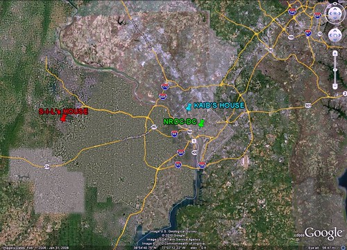
For example, the location of NRDC’s Washington office (marked on the Google Earth image above in green) has a very high degree of regional accessibility, being located right in the center of the DC metro area, where walkability is high, transit plentiful, and average driving distances relatively short. We would expect it to perform well compared to regional averages and other locations. My house (blue), in a residential neighborhood northwest of downtown, is still walkable and relatively centrally located. We would expect it to perform well, too, compared to the regional average, though not quite as well as a downtown office. But my sister-in-law lives in an outer suburb (red), far from the regional center. We would expect her location to perform poorly compared to the regional average (she has to spend an insane amount of time in her car, shuttling her kids around) and to the two locations in DC.
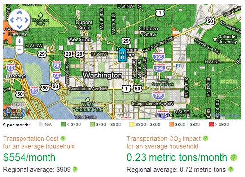
Abogo indicates that, according to the data, all of our expectations are confirmed. Here is NRDC’s office and its scores:
Note that a household residing in NRDC’s neighborhood would generate only about a third the transportation emissions of an average household in the region. Now here’s my house:
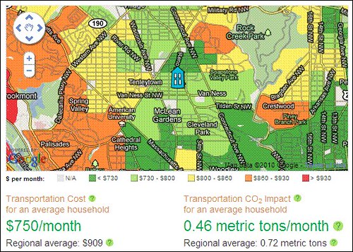
At the risk of being self-congratulatory, I note that our emissions and transportation costs are well below those of the region as a whole. But look at my sister-in-law’s location:
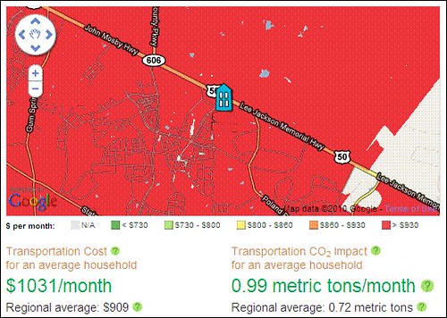
Unfortunately, she and her neighbors average over a thousand dollars per month in spending for transportation, and generate a whopping 40 percent more carbon for transportation than the regional average, and over four times the amount that an average household in NRDC’s neighborhood generates. Why? Longer distances to drive to do most anything, little to no transit, few destinations within comfortable walking distance.
CNT explains its methodology here including, in part, the following:
“We estimate total transportation costs for an average household from your region living in your neighborhood, including commuting, errands, and all the other trips around town. We count money spent on car ownership and use, as well as public transit use. For CO2 emissions, we count car use only. We use data from the Housing + Transportation Affordability Index, a project of the Center for Neighborhood Technology.”
Much more on the site, of course. Well done. Go here to try it out for yourself and for more information on Abogo.
Move your cursor over the images for credit information.


