Interactive map shows where Americans are moving

Posted March 30, 2011 at 1:29PM
In a feature posted by Jon Bruner, Forbes.com has published an amazing map showing every US county and containing migration data from 2008 for any pair of counties that the user selects. You begin by clicking on a location, and the map shows various shades of red (outmigration) and black (inward migration) lines for the county chosen.
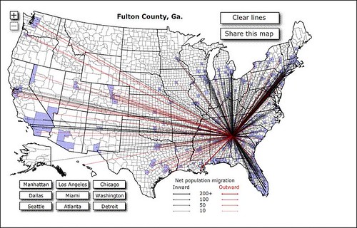
For example, the map below has a lot of black lines, showing a lot of people moving to Fulton County, Georgia (Atlanta):
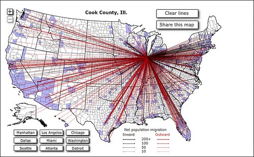
But the picture isn't as positive for Cook County, Illinois (Chicago), where red lines showing outmigration, especially to the Sun Belt, dominate:
You can also find precise data by moving your cursor over the counties. For example, with the map focused on Chicago, I moved the cursor over Buncombe County, North Carolna (Asheville), and learned that 46 people moved from Asheville to Chicago in 2008, while 53 people moved from Chicago to Asheville. But, perhaps more significant, the 53 people moving from Chicago to Asheville had three times the income, on average, of the 46 moving in the other direction. Focusing the map on Buncombe County, I also learned, somewhat surprsingly, that seven times as many people moved to Asheville from Miami in 2008 as moved to Miami from Asheville.
I suspect that the map may prove useful for finding trends with implications for land use, planning, and economic development. But right now I mostly find it fascinating and fun.
Move your cursor over the images for credit information.

