Warning: transit data may not mean what you think they mean

Posted May 23, 2011 at 3:23PM
There were a lot of stories in the press last week about a voluminous study by the Metropolitan Policy Center at Brookings (which does great work and a lot of it) on the best and worst places in the US for public transit. That’s the way the headlines read, anyway: “The 10 Best (and 10 Worst) Cities For Public Transportation,” proclaimed the top of the story by my fellow writer on The Atlantic’s web site, Derek Thompson.
Imagine the surprise when people noticed that automobile-dependent Fresno and Modesto ranked higher than New York and Chicago – you know, cities where people actually do find transit comparatively convenient and efficient.
The problem is that “best and worst for transit” isn’t what the Brookings study actually measured. Rather, the study looked at the number of residents living within ¾ mile of a transit stop (studies show that people generally won’t walk more than ¼ mile to the bus), and the number of jobs within a 90-minute transit ride from those stops (a generous amount of time, given that few people are willing to spend 90 minutes each way commuting unless that have absolutely no other choice). Brookings was not really measuring whether transit service was good (the study didn’t look at frequency of service, either), but whether it was even possible to take or not – the point being that, in some places, it’s impossible, even if you’re willing to walk farther than research says people will walk and take more time than research says people will willingly take.
Brookings deserves credit for suggesting that we should at least figure out a way to make transit commuting remotely possible, especially for working families who cannot afford to drive. Look at the useful points made in the study's summary on the Brookings web site. I might argue that, in this context, the rankings of “best” cities mean little; but the rankings of the “worst” do, because they identify the places where public transportation is inaccessible no matter how desperately one needs or wants to use it.
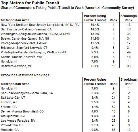
Here’s a comparison of the actual top ten cities for transit, as indicated by the shares of workers who use transit regularly, to the top ten for at least possible transit coverage as found by Brookings:
Note that, in the Brookings list, #10 Modesto has only a 0.8 percent transit mode share, meaning that 99.2 percent of Modesto commuters get to work some other way. Of the 100 cities researched in the study, Modesto ranks #83 for actual transit usage, meaning that, whatever is theoretically possible, the people in Modesto think the service is pretty lousy.
This illustrates what I really dislike about “rankings” in research: especially when reported in the media, they completely miss the nuances or, as in this case, even the main point that the public is likely to take. But advocacy organizations (I should caution that Brookings is not really an advocacy organization) do rankings all the time, even contriving ways to turn data into rankings, simply because they get press coverage. The media eat this stuff up.
I’m guilty, too. Look back through my blog archives and you’ll find me reporting lots of best and worst rankings from various sources, because it’s sort of fun, and gives me a handle for writing about concepts that are important. I even got into Brookings-like trouble a couple of weeks ago, when I reported on cities found by the Pedestrian and Bicycle Information Center to have high scores for implementing “walk-friendly” policies. I cautioned in the post that there was a difference between implementing policy and actually being highly walkable, and that only cities that applied for a rating were scored by the Institute. Of course, readers completely glossed over the disclaimers, and so did one of my editors, headlining my story, “Pedestrian Perfection: The 11 Most Walk-Friendly U.S. Cities.” Upon reflection, that was completely understandable, and maybe I deserved the grief I took for it.
In the case of the Brookings story, things only got worse when one of the study’s authors tried to explain why all of the top-ranking cities in the study were in the West, apparently grasping to argue that cities in the American west not only are inherently better for smart growth because of their geography but also because they have better smart-growth policies. I'm guessing that site visits must not have been made by the researchers to Phoenix, Las Vegas, or even Modesto. The one western city that nearly everyone in urbanist circles would agree has superior smart-growth policies, Portland, did not make the top list. I will give them this: Honolulu can hold its head high, being the only city to make both the theoretical top 10 and the actual top 10.
For some thoughtful commentary on what the Brookings study does and does not mean, see Nate Silver’s article on The New York Times site, and Richard Layman’s on Rebuilding Place in the Urban Space.
Move your cursor over the images for credit information.


