New DC data confirm real estate recovery strongest in central & transit-served locations

Posted March 26, 2013 at 12:56PM
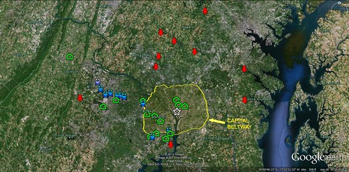
New data from the Washington, DC metro area, published this month in The Washingtonian, show that the area’s real estate recovery since 2009 has been strong. But it has not been equally strong in all locations: for the most part, the zip codes where median prices have increased the most – by an impressive 25 percent or more – are within the DC city limits, in its inner suburbs, or near rail transit. The zip codes where median sales prices have declined are predominantly in outer areas.
The magazine provided median price data, along with trend data for 2009-2012, for the metro region’s 100 highest-priced zip codes. That excludes some important information, but still provides a lot to analyze. Using that data set, I mapped the places within the region where the gain in median sales price exceeded 25 percent, and marked them with green house symbols. I then mapped the places where median sales declined by any amount, and marked them with red “down” arrows. To show proximity to the region’s center, I marked the Capital Beltway in yellow and slightly shaded the area inside.
For most people, the Beltway marks the boundary between inner and outer suburbs. If you’re “inside the beltway,” people think of you as close to downtown. For the locations in the outer suburbs that gained value, I also marked the nearest Metro or commuter rail transit station in blue. The transit line running northwest of the Beltway is Metro’s silver line, now under construction out to Dulles airport. That corridor has some of the locations that are doing well.
This is not to say, by the way, that every place with rail transit did well; they didn’t, and at least two of the locations where sales prices declined have rail transit. It is also not to say that the locations where prices increased in the outer suburbs are walkable to transit in all cases; it would be more accurate to say that some are transit-influenced, with the feeder bus or drop-off ride within a very short distance to the station. But the point is that, of those outside-the-Beltway locations that gained 25 percent or more in median sales prices, all but one or two have rail transit service nearby. None of the places in The Washington’s “Top 100” that lost value is inside the Beltway.
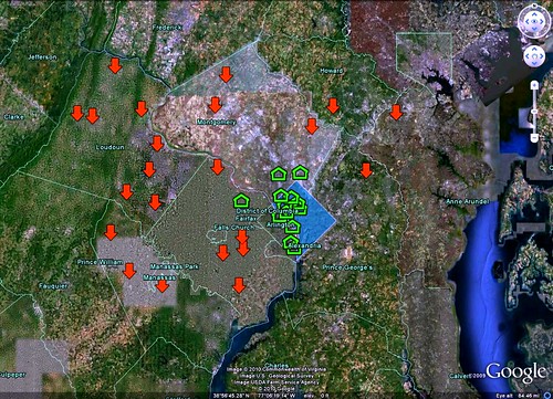
This confirms the pattern demonstrated in a similar map I marked three years ago, using 2006-2009 data, also from The Washingtonian. The news on median prices during that period in the DC region, as elsewhere, was not so good. In that case the green houses marked zip codes that had gained median value by any amount; the red arrows marked zip codes where median prices had declined by 25 percent or more. (For 2009-2012, there was no such location.) Economic circumstances have changed dramatically, but the geographic trend has not: inner locations are increasing in value more than outer locations; outer locations are losing value more than inner ones.
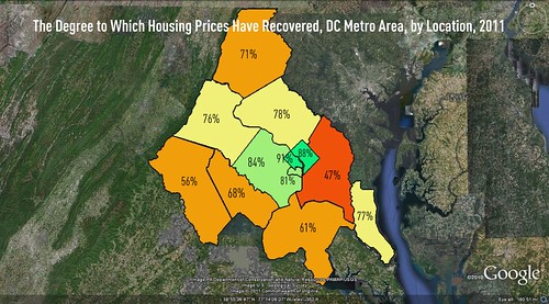
A third data set, not as fine-grained, compared median housing prices around the area in 2011 to those prices at their peak, before the recession hit. I couldn’t resist making another map, and what it showed was that none of the 12 jurisdictions I mapped had recovered fully, although Arlington County (historically part of the District of Columbia and the most urban of metro-area counties) had recovered 91 percent of its median value; DC proper had recovered 88 percent. The jurisdictions that had recovered the most were the most centrally located; the jurisdictions that had recovered the least, with one glaring exception, were the ones farthest from the region’s center. The exception was Prince George’s County, which I discussed in my article accompanying the map.
I’ve been following this story ever since I began writing in this space, most recently here. The conclusions have only become stronger over time.
Related posts:
- DC issues ambitious plan to become "the healthiest, greenest, and most livable city in the United States" (February 20, 2013)
- Why smarter land use can help cities attract and retain young adults (February 1, 2013)
- New housing forecast mostly good for walkable communities (May 17, 2012)
- How the evolving housing market will help sustainable communities (April 4, 2012)
- Geography of housing recovery favors cities and walkable neighborhoods (October 26, 2011)
- Housing market strengthens for smart growth: dramatic new data from the DC area (April 26, 2010)
- When the real estate market recovers, smart growth will claim a larger share. Here’s why. (April 10, 2009)
Move your cursor over the images for credit information.


