Can quality of life be mapped?

Posted April 19, 2013 at 3:06PM
Earlier this week at the annual conference of the American Planning Association, I attended a very interesting session on GIS mapping of combined data sets. It was billed as a session on “mashups,” which I suppose the presenters thought would attract more attention than, say, “geographic information systems.” (Best definition of a mashup by a member of the audience: “Iron Maiden and Lady Gaga.”)
Anyway, as a lover of maps I enjoyed the session. If they had known about it, I suspect the panelists would have enjoyed an especially creative use of GIS by Osakpolor Esosa Stephen of Nigeria’s Igbinedion University, assessing the geography of quality of life assessments using GIS. A link to his research showed up in my Twitter feed last night.
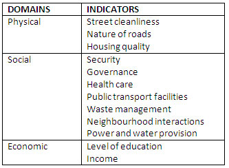
Stephen combines the geography of several data sets believed to affect quality of life:
“The research uses twelve indicators under various domains of life in order to assess [quality of life], and reveal areas that consist of people with low QoL as this will aid poverty alleviation decision making process since policy makers are interested to know the most effective means of improving individuals' lives. The outcomes of this study are expected to help city planners to understand and prioritize the problems that the community faces.”
That first sentence is a long one, but you get the idea. The study was published this week on the website Geospatial World.
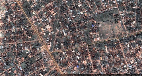
Stephen used a questionnaire to obtain responses from 243 residents of the Egor area of Benin City, Nigeria. (Egor is one of the “Local Government Areas” within Benin City, the administrative capital of Edo State in southern Nigeria.) The questionnaire was systematically distributed among Egor’s 10 wards; each resident rated 12 indicators on a five-point scale from “extremely poor” to “excellent”:
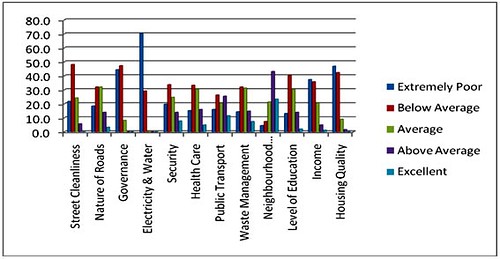
In general, you can see from the results that residents do not perceive their living conditions to be very good (nor should they, from the photos of flooding and contamination that I have seen). Ratings of “extremely poor” and “below average” dominated the findings, though the residents rated their own neighborhoods highly as a general matter. Public transportation was rated by a significant number of respondents as average or above average:
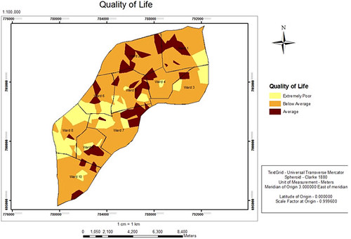
Because the location of each respondent was predetermined, Stephen then mapped the responses for each indicator. He combined the maps to produce a composite map showing the geographic distribution of overall quality of life throughout Egor, as determined by respondents’ self-assessments:
Stephen summarized the findings as indicative of where government assistance is most needed:
“The study revealed that very few people of Egor LGA exhibit average [quality of life], while others exhibit below average or extremely poor QoL. The research has shown that governance, power and water provision, income, and housing quality have relatively more impact on the QoL of the people of Egor LGA.
“The implication is that there is urgent need for proper intervention in order to improve the QoL. The study has also shown the relevance of participatory planning, as those being planned for can best determine priority areas.”
It occurs to me that similar mapping exercises might reveal very useful spatial planning data in US locations such as Rockford, Illinois that are pioneering “Vital Signs” sustainability indicators to assess quality of life. It could also be useful in revealing the geography of progress on the “happiness” indicators being pursued in Victoria, BC and Seattle, as well as in the Himalayan nation of Bhutan. (Recommendation: use the “mashup” vocabulary in Seattle.)
This may be the mushier side of city planning compared to, say, measuring street connectivity or income distribution. But that doesn’t make it less important. A blog post by Rashid Faridi on the Nigerian study astutely observes that “subjective indicators have lower data reliability [but] higher validity.” Indeed.
Related posts:
- Measuring community sustainability: how do we know if we're on the right path? (June 21, 2012)
- The environmental building blocks of urban happiness (February 2, 2012)
- What does 'the pursuit of happiness' mean for communities? (June 29, 2011)
- Why we love the places we love - what the research says (November 24, 2010)
- Constructing a city around the concept of happiness (March 5, 2010)
- US cities fare poorly in international “quality of life” rankings (April 30, 2009)
Move your cursor over the images for credit information.


