How to go green, according to architects

Posted April 30, 2008 at 1:10PM
The American Institute of Architects has announced their annual “Top Ten Green Projects,” as chosen by the Institute’s Committee on the Environment (affectionately known as “COTE”).
Now I have to say that I personally like and am impressed by just about everyone I’ve met from AIA’s environmental circles. I was flattered that they asked me, even as a non-architect, to serve on one of COTE’s sister committees, the committee on Communities by Design. (We supply the “community” side, get it?) We’re meeting later this week in Los Angeles, and I pretty much love the group of people. I think one or two of them are delegates from COTE, which is where it may get interesting, considering the rest of my post . . .
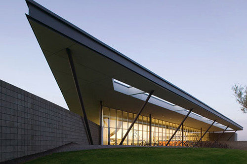
If I were to give advice to a designer about how to win this award next year, I would say the following: Stick very carefully to modernist design, preferably with long horizontal lines and sharp angles; surround your building with lots of grass and landscaping; have razzle and dazzle; don’t worry at all about the pesky fact that buildings in remote or sprawl locations waste more energy for transportation than they save in building efficiency; locate on a campus if possible; don’t bother with re-using historic properties, notwithstanding all that already-imbedded resource efficiency; total automobile dependence is just fine; neighborhood-y stuff is for sissies, don't worry about it; and for heaven’s sake don’t even think about affordable housing, or really about housing at all, OK?
I guess COTE didn’t get the memo about how much transportation efficiency matters to the climate or the environment, or how much being in a diverse neighborhood with amenities, shops and services promotes public health by encouraging walking.
As I posted some time back, there is a crude but very useful tool on the web called Walk Score. It measures the proximity of a given address to various categories of diverse uses, such as grocery stores, restaurants, schools, parks, drug stores, and other retail. It paints with a broad brush, so I wouldn't rely on it for anything terribly precise or consequential. But it’s a pretty good indicator of whether a location is in a real neighborhood or not, as well as how automobile-dependent it is. If the base location is residential, a high score means a resident can likely reach a lot of common destinations on foot, or at least with short driving trips. If the base location is commercial or institutional, a high score means a worker or visitor can conveniently run errands and combine trips to the base facility with visits to other common destinations. Both suggest a location that has good regional accessibility, and both mean less driving and less carbon dioxide in the atmosphere. If the score is low, anyone who lives or visits is basically driving some distance to get there.
You may recall that I entered the addresses of NRDC’s four large offices in New York, Washington, San Francisco and Santa Monica in Walk Score’s calculator. It turns out that we’re awesomely located, with walk scores of 100, 98, 98, and 97, respectively. My home, in a more residential area of Washington, still does pretty darn well with a 72 (“very walkable” under the system’s scale), but my in-laws in an outer suburb don’t fare so well with a 43 (“not walkable”). Below are the walk scores for the AIA’s “Ten Greenest” projects of 2008. Remember, scores above 70 are considered “very walkable,” while scores below 50 are considered “not walkable” and are likely to generate very high rates of driving as well. Scores from 50-70 are in between, with “some walkable locations”:
- Aldo Leopold Legacy Center, Baraboo, WI: ZERO
- Cesar Chavez Library, Phoenix, AZ: 15
- Discovery Center at South Lake Union, Seattle, WA: 100!
- Garthwaite Center for Science and Arts, Cambridge School of Weston, Weston, MA: 43
- Lavin-Bernick Center, New Orleans, LA: 71
- Macallen Building Condominiums, Boston, MA: 86
- Nueva School Hillside Learning Complex, Hillsborough, CA: 14
- Pocono Environmental Education Center, Dingman’s Ferry, PA: ZERO
- Queens Botanical Garden Visitor & Administration Center, New York, NY: 82
- Yale University Sculpture Building and Gallery, New Haven, CT: 91
I count one residential building and nine educational or institutional facilities. You certainly can’t fault the jury for seeking diversity in a way that compromised their design standards.
Now, the five that score so poorly, including the two zeros (!), are not without merit as examples of good architecture and of good use of green technology. But to call them the greenest projects in the country is just plain ridiculous. That completely ignores the most important contributor of global warming emissions of all. (Transportation emits 31% of our greenhouse gas emissions; commercial buildings emit 16% and residential buildings emit 19%. The rest is industrial.)
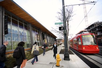
I guess we should be glad that they at least got some of them right. I love the South Lake Union project, pictured above. As the description on the AIA site reads, the facility “is centrally located within an emerging neighborhood of residential communities, offices, and nearby private schools, and provides the only available green space suitable for field activities . . . The building is located at the intersection of two arterial streets and invites pedestrian interaction. In addition to hosting exhibit space showing the history of the neighborhood free of charge, the facility is available to residents of the community for private meetings and after-hours functions. The Discovery Center hosts summer block parties for the neighborhood and an outdoor film series during the summer months.
“The site is easily accessible via public transit with two bus stops at the corner serving numerous routes. The South Lake Union streetcar also runs along the Westlake Avenue corridor with a stop adjacent to the Discovery Center . . . The off-street parking area also includes a reserved space for a car belonging to a car-sharing program.”
Congratulations to the Miller|Hull Partnership in Seattle for the design, and to their client for selecting a site that delivers environmental benefits. And congratulations also to the designers and patrons of the Lavin-Bernick Center, the Macallen Building, the Queens Botanical Garden Visitor Center, and the Yale Sculpture Building, all of which are well sited as well as well designed.
You can read about all the winners and see plenty of pictures here.

