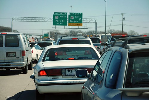
Metro area commuting data from Brookings: best and worst performers nationally

Posted May 12, 2010 at 1:37PM
Yesterday the Brookings Institution’s Metropolitan Policy Program released its signature report, The State of Metropolitan America. The study is a comprehensive examination of a range of data indicators on America’s 100 largest metro regions. According to the project’s website, the analysis “portrays the demographic and social trends shaping the nation’s essential economic and societal units—its large metropolitan areas—and discusses what they imply for public policies to secure prosperity for these places and their populations.”
To say that the report is data-rich is a massive understatement (if that’s not an oxymoron), and I don’t pretend to have digested all of it it. I did, however, take a quick look at the report’s commuting data (presented in interactive form here), and out of the 100 regions these are the best and worst performers:
Regions with the smallest shares of workers driving alone to work:
(National average share for 100 largest regions: 74.0%)
- New York-Northern NJ-Long Island NY-NJ-PA 50.3%
- San Francisco-Oakland-Fremont CA 62.4%
- Honolulu HI 64.2%
- Washington-Arlington-Alexandria DC-VA-MD-WV 66.3%
- Seattle-Tacoma-Bellevue WA 69.0%
There are no surprises among these good performers. These are regions with an abundance of walkable neighborhoods and a strong commitment to public transportation. I’m pleased to see the DC area on the list, though it’s a little frightening to consider that the reach of our metro area now includes part of West Virginia. Boston and Portland came in at numbers 6 and 7, respectively, on the list with the smallest shares.
Regions with the largest shares of workers driving alone to work:
- Youngstown-Warren-Boardman OH-PA 85.1%
- Wichita KS 84.6%
- Akron OH 84.4%
- Baton Rouge LA 84.1%
- Knoxville TN 84.0%
I was a little surprised to see two older industrial regions among the metros with the highest shares of driving.
The next two categories reveal which regions improved or worsened the most during the last decade:
Regions whose share of workers driving alone to work decreased the most since 2000:
(National average change in share for 100 largest regions: -0.2%)
- Austin-Round Rock TX -3.6%
- Dayton OH -3.3%
- Portland-S. Portland-Biddeford ME -3.2%
- Poughkeepsie-Newburgh-Middletown NY -2.9%
- Bridgeport-Stamford-Norwalk CT -2.7%
Some of Austin’s improvement may be attributable to the light rail line (above left) that has become operational there since 2000. I don’t have a ready explanation for why the other improving regions placed as they did.
Regions whose share of workers driving alone to work increased the most since 2000:
- New Orleans-Metairie-Kenner LA +5.3%
- Modesto CA +3.3%
- El Paso TX +3.2%
- Las Vegas-Paradise NV +3.0%
- Oxnard-Thousand Oaks-Ventura CA +3.0%
Among the bad performers, New Orleans can be excused because of the Katrina tragedy. The other four are all Sun Belt regions where sprawl worsened during the decade. I believe the last year of data that Brookings accounted for was 2008, though, only a few months into the recession and suburban housing collapse that affected the Sun Belt particularly hard; I wonder how the data may have changed since then.
I think the share of workers driving alone is the most environmentally relevant of the mode-share statistics in the report. If three-quarters of us drive to work nationally, a reasonable goal of public policy might be to lower that share to two-thirds. Even more relevant environmentally might have been a measure that also took into account the average distance driven by commuters, since that might more closely track carbon emissions and also be a richer data point for metropolitan land use policy. After that, I think that the walking/bicycling share would be particularly revealing. We don’t have those from the Brookings data (this was not primarily a transportation study), but we do have information on public transit usage:
Regions with the highest rates of commuting by public transportation:
(National metro average: 7.0%)
- New York-No. NJ-Long Island NY-NJ-PA 30.4%
- San Francisco-Oakland-Fremont CA 14.4%
- Washington-Arlington-Alexandria DC-VA-MD-WV 13.4%
- Boston-Cambridge-Quincy MA-NH 11.7%
- Chicago-Naperville-Joliet IL-IN-WI 11.3%
Those five are the only regions in the country scoring above 10%. I also wish that, for all the statistics but especially this one, we had a national median as well as a national average. The sheer number of transit commuters in the New York region is high enough to have an outsized influence on the national average. (Incidentally, a somewhat different accounting of commuting data from the Census for 60 metro regions does include national medians, as well as walking and bicycling shares.) In any case, 7% nationally is a very low rate; the median share is probably even lower.
Regions with the lowest rates of commuting by public transportation:
- Palm Bay-Melbourne-Titusville FL 0.3%
- Lakeland-Winter Haven FL 0.4%
- Knoxville TN 0.4%
- Tulsa OK 0.4%
- Greenville-Mauldin-Easley SC 0.4%
 That’s just pathetic, particularly for Knoxville and Tulsa, which have sizable populations and should have well-functioning transit systems (which isn’t to say that they do, obviously). Knoxville is also a “winner” among the regions with the highest drive-alone shares.
Carpooling, by the way, is most popular in Bakersfield CA, Honolulu HI, Stockton CA, Cape Coral-Fort Myers FL, and McAllen-Edinburg-Mission TX, whose carpooling shares ranged from 17.1% to 14.2%, soundly beating the national metro average of 10.3%. Carpooling is least popular in the New York-Northern NJ-Long Island region, followed by Akron OH, Youngstown-Warren-Boardman OH-PA, Springfield MA, and Cleveland-Elyria-Mentor OH; the shares ranged from 7.3 to 8.1%. It is a curious coincidence that carpooling is unpopular in both the New York-NJ region, whose drive-alone share is among the lowest, and in Akron, whose drive-alone share is among the highest.
All of the Brookings data, including several video explanations, may be accessed here. An interactive site that slices and dices not just commuting data but also information on population, race and ethnicity, immigration, age, households and families, educational attainment, work, and income and poverty, may be accessed here. It reflects all 100 regions in the study, not just the best and worst performers that I highlight in this post.
Move your cursor over the images for credit information.
