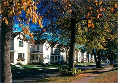
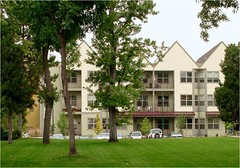
A close look at a smart growth icon: Denver's Highlands' Garden Village (conclusion)

Posted July 21, 2010 at 1:30PM
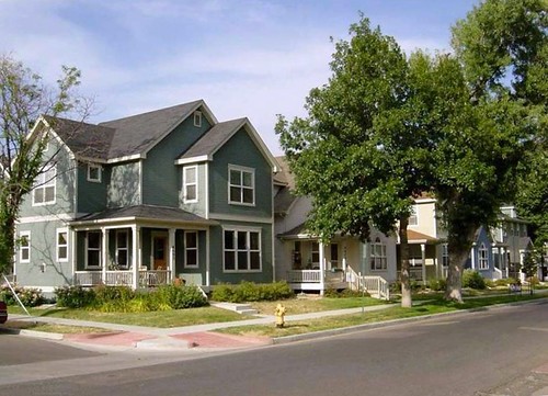
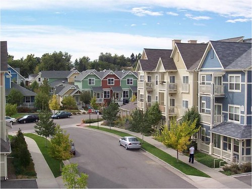
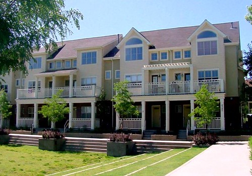
Denver’s Highlands’ Garden Village is justly regarded as one of the country’s best exemplars of smart, green urbanism. As I wrote in yesterday’s post, it has some of just about everything we look for in a great neighborhood development, from mixed uses and incomes to parks and green landscaping to great walkability and access, and more.
I ended yesterday’s post with a provocative question: as good as it is, could HGV have been better? My answer: yes and no. Read on.
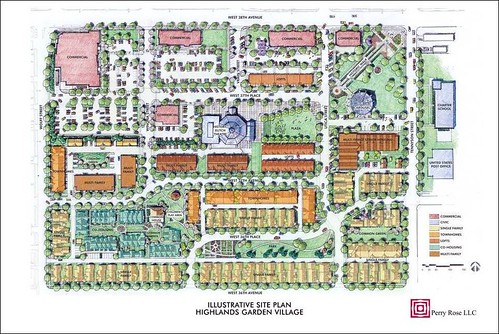
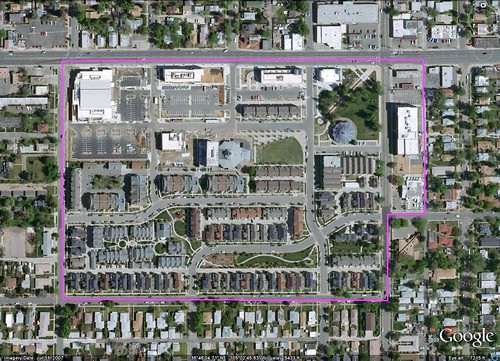
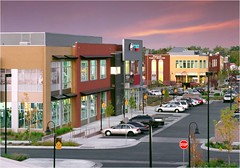
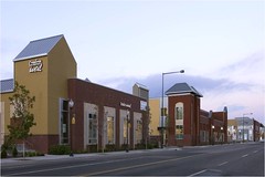
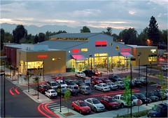
If I have a complaint, it is probably with the project's commercial areas - which, compared to the residential sections, look more suburban to me and definitely less dense. Notice in the site plan above and Google Earth image just underneath it how much of the land in the northwestern portion of the site, a commercial area, is given to surface parking.
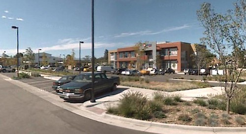
Here are a few photos of that part of the neighborhood, some taken from Google Earth’s street view feature and some from HGV’s developer, Perry Rose:
Now, to be fair, Google Earth’s street views can be very wide-angle and a bit distorting, and the colors and ‘composition’ considerably less than flattering. The trees shown in the site plan for the parking lots and barely visible in the images are far from mature and will begin to enhance the appearance of the lots quickly as they grow canopies. That will also provide more environmental functionality, particularly in shading and helping cool the parking surface. In addition, the commercial buildings do address the street, not a parking lot, on the 38th Avenue side. But, so far at least, I think the commercial sections don’t quite match up to the residential sections in variety, density, walkability, or environmental function.
I doubt that the developers would disagree much, actually. But Chuck Perry of Perry Rose pointed out in helpful email correspondence that the low-density, high-parking design was largely required by the retail tenants:
“We were successful in reducing the city’s parking requirement from one space per 200 square feet (of retail space) to one per 350 square feet. [But] all of the retail tenants have required at least one space per 200 square feet. On the one block built with one space per 350 square feet we have actually had potential retail tenants reject the space because they did not feel there was enough parking. In fairness, parking is at a premium at times. However, over time I think we will see parking demand diminish as the younger generation begins to drive less and use alternative modes of transportation.”
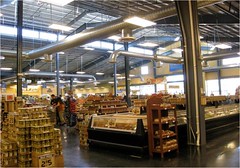
On the plus side, Chuck reports that the Sunflower market, the project’s LEED-certified supermarket and the building in the site’s northwest corner (more photos just below), has been immensely successful commercially.
Parking for both commercial and residential portions of the project was one of the many concerns raised by NIMBY opponents of HGV when its approval was being considered by municipal authorities. In flyers headlined “Too Dense Makes No Sense,” the “Coalition for Responsible Elitch Development” also pushed for a maximum residential density of 200 units on the 27-acre site, a minimum of 50 percent of the site devoted to park space, and “safe street widths.”
By "safe street widths," they were essentially asking for wider streets. Narrower streets are generally preferred for smart growth because they slow traffic, place less runoff-inducing impervious surface over the ground, and allow more efficient use of land compared to wider streets. But fire departments push for wider streets to give their ever-widening vehicles more maneuvering room. HGV's street widths are the proiduct of compromise: Jonathan Rose (the Rose of Perry Rose; in the interest of disclosure, I should mention again that Jonathan is a friend and an NRDC trustee) reports that HGV’s developers sought 28-foot street widths, while the fire department insisted on 36. The city of Denver eventually permitted 32 feet. Jonathan says he would have preferred that additional land that could have been made available for other uses by using the narrower width be given over to park space instead. I agree, but I’m glad they accomplished at least some accommodation on that point.
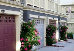
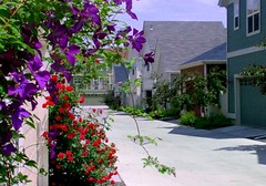
Chuck and Jonathan also have said that they wish the project could have had a bit more residential density with, for example, accessory flats on every for-sale house. (HGV's alleys, above, are ideal for accommodating accessory apartments.) HGV does have such units but, in a concession to community demands, they appear on only one of every three of the single-family homes. The developers also would have liked to have had additional types of housing (though, as noted yesterday, HGV as built contains a remarkably diverse array of housing choices), such as three- to four-story condos, perhaps where one of the commercial buildings now stands and, interestingly, some one-story townhouses as end units, providing options for residents who might have difficulty accessing stairs. But the first was infeasible given community resistance to density and the second because it would have made grading issues more difficult.
I am actually fine with the residential density as it now stands. The average density of the residential portion of the project is 22 homes per acre, which is more than adequate to encourage walkability and make good use of the site. It is also an increase from nearby residential density. In most cases I prefer that we increase density incrementally on infill and redevelopment sites, to respect the existing character of the community, and that seems to be what HGV has done here.
Chuck also reports that, in retrospect, he would have swapped the sites for the commercial gym (the second building from the left on the north boundary of the site) and the retail building to its east. That would have allowed the retail building to attract restaurant tenants, which are currently discouraged because liquor licenses are not allowed within 500 feet of the school on the eastern edge of the site:
“We made a very conscious decision to include a charter school as part of the project because improving the quality of education in urban neighborhoods is critical to attracting young families back to the city. [But] we realized that locating the school on Tennyson Street [running north-south by the park with the pavilion] would preclude liquor licenses from the line retail.”
Jonathan also wishes they could have incorporated more contemporary design. (The neighbors preferred traditional.)
All that said, the developers are clearly proud of their accomplishments with HGV, as well they should be. Jonathan stresses that he is especially pleased with the co-housing, which puts “advanced community” in the center of the development, and with the concept of a “garden community,” with the enjoyment of actual gardens and diverse, native landscaping tended by resident volunteers.
My verdict is that while improvements, especially in the commercial sections, would have enhanced HGV’s appearance and function as a smart, green development, for the most part those improvements were only theoretical in this case. Perry Rose pushed the envelope as far as they could in a green direction given their commercial, regulatory and community situation, and ended up with a terrific result. Over time, economic conditions may allow for further improvements in the commercial areas (with, for instance, more density and structured instead of surface parking), but the perfect need not become the enemy of the truly excellent. On balance, I believe the residents, the environment and our shared cause all have a winner in Highlands’ Garden Village.
See Part 1 here.
Move your cursor over the images for credit information.
