Educated class flocks to urban environments

Posted December 7, 2010 at 1:28PM
One of my favorite bloggers, Aaron Renn (The Urbanophile), has a new post analyzing migration patterns of college graduates in the last decade, 2000-2009. In particular, he reports on changes in what might be called educated density, expressed as college grads per square mile.
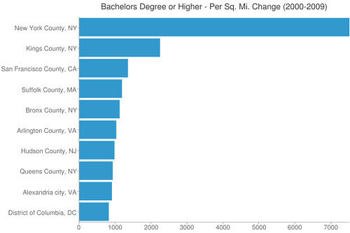
Here are the US counties that added the most graduates per square mile in the last ten years:
Not one is suburban in character. Hudson County, New Jersey, which includes Jersey City, is that state’s densest. Kings County in New York is basically Brooklyn. Suffolk County in Massachusetts includes Boston. In the Washington area, Arlington and Alexandria are technically suburbs, but they are both really urban and the closest jurisdictions to DC on the Virginia side of the Potomac.
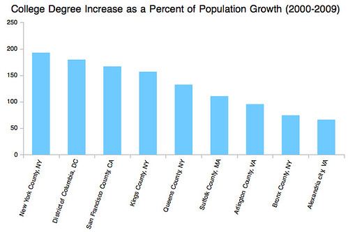
Here’s another of Aaron’s graphs, this time showing the increase in college grads as a percentage of the overall population increase in these places:
Note that, in most cases, the number is higher than 100 percent, meaning that there has been a bigger gain in college grads than there has been in overall population. The number of non-graduates in those 100-percent-plus jurisdictions actually shrank. While this perhaps suggests a troubling threat to (or indicator of) affordable housing in inner cities, it also strongly reinforces what so many of us have been saying for the last couple of years: urban environments have become much more attractive to people who have choices about where to live. Think about what a reversal this is from most of the late 20th century, when the basic paradigm was that the affluent were fleeing central cities for new suburbs. (It also reinforces my assertion from yesterday’s post that circumstances have changed since the basic smart growth agenda was assembled.)
Go here for the rest of Aaron’s analysis, including some additional interesting graphs.
Move your cursor over the images for credit information.

