The messy issue of design in smart growth

Posted January 6, 2011 at 2:25PM
This post is another collaboration with my friend and frequent writing partner, Lee Epstein, a land use planner and attorney working in the Mid-Atlantic region. The first part is mine; the second is Lee’s. I’ll tell you when.
Many people who live in places undergoing change, and that includes most all of us, are fearful of what those changes may bring, even (some would say especially) if those changes are labeled as “smart growth.” I find this immensely understandable, particularly given some of the changes that we have witnessed in our built environment over the past few decades. For example, four years ago, Michael Rosen wrote in the New York City neighborhood paper The Villager:
“[O]ne by one these and many other instances pile up and by their height and weight crush the character that makes this place our home. Our diverse ethnicities and income levels, our extraordinary range of interests become mostly homogenized in a relatively rich way. The crucible of our diversity, doubt, dissent and creativity is tied in direct ways to the walkup height of most of our buildings, to affordable rents, to slow streets and the possibility of gathering places and dialogue — neighborhood coffee- and teahouses, local bars, community gardens and their casitas, affordable storefronts and miraculous community centers.”
I do not know Rosen’s East Village neighborhood or circumstances. But to this reader’s eyes his concerns are those of a thoughtful resident, not a knee-jerk opponent to all change. 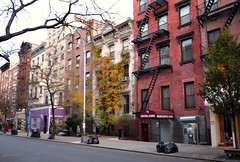 The things he believes are threatened by development are the very things that most of us espouse, and even include in our definitions of smart urbanism.
Here’s another quote, this one commenting more specifically on building design. Writing in The New Yorker last month (subscription required), Paul Goldberger describes part of an ongoing (and somewhat iconoclastic) revitalization of a faded industrial district in Culver City, California. The project is all about showy, avant-garde design:
“[Architect Eric Owen] Moss’s buildings . . . may have demonstrated his earnest, if relentless determination to probe different kinds of materials, spaces, and shapes, but I found it hard to avoid the impression that the main point of a design like The Box – a distorted cube of dark metal on legs that Moss plopped on top of another building – was to make sure that you knew that an architect had been there.”
Now bear with me for yet another, particularly telling passage from the same article:
“The Hayden Tract is as car-dependent as the rest of the city and just as lacking in meaningful outdoor public space in which to enjoy its benign climate.
On my last visit, I didn’t see anyone walking along the street from building to building, save for a handful of architectural tourists. In one part of the project, five of Moss’s buildings face one another across an open space. It’s a grand gesture – sharply slanted glass facades and irregular glass canopies define the edges of the space – and a perfect opportunity for a modernist rethinking of a traditional piazza. Instead, it’s filled with parking spots.”
Again, it’s a neighborhood that I don’t know personally, and perhaps it will eventually evolve into the arty contemporary quarter that its designers apparently envision. I like some of the architecture that I have seen online, though the examples published with Goldberger's article are way too in-your-face with iconoclasm to suit my taste. But, individual buidings aside, right now the district appears to be a long way from becoming a "neighborhood" in any conventional sense of the word. The best one can say is that maybe it’s a work in progress that, for the time being, misses an opportunity to create a cohesive community.
Readers know that few people champion revitalization more than I. But it has to be high-quality revitalization, not just a bunch of high-rises gobbling up a streetscape that was once of more inviting scale,  and not disjointed buildings drawing attention to themselves without relating well to each other and the whole, either. We must be careful what we wish for.
For some time now, I have been engaged in a sort of conversation with myself (heh) about what I see as too much mediocrity in the name of smart growth and urbanism, spiced with not a little developer's greed. I think the character of what we build matters, because we who believe the health of the planet depends on more development that conserves land and watersheds while reducing emissions must sell our product, before planning commissions and neighborhood review boards all across the country. If our product isn’t better than the alternative – and I don’t mean just in the regional or abstract sense but in the local, right-in-this-spot sense – we won’t have enough (and maybe don’t deserve enough) takers to make our proposition work. We need to advocate quality of smart growth as avidly as we advocate its quantity.
I’ve been chipping away at these concepts on this blog. To an extent, they were implied in my post from earlier this week on wellness. Aspects were certainly involved in a number of posts that I cited in my best-of-year entry, and even in my very first post on this blog, “Architecture matters.” In a related post from two years ago, I asked, “Does beauty matter? Should it?”
I think it does, quite possibly a lot. But it sure is messy, because (at least in my opinion) quaity and beauty in design don’t lend themselves easily to objective measures. We can measure things like transit boardings, impervious surface per capita, vehicle miles traveled, and people accommodated per unit of land. That’s what leads us to advocate neighborhood density, transit access, mixed uses, and all the other components of “smart growth” or urbanism, be it of the “new” or old variety. But it’s harder to measure what we lose if we can’t build enough of smart growth to make a difference because what we’re offering doesn’t make a good neighbor to its surroundings or a nourishing home for its inhabitants. It's also harder to measure what neighbors and residents lose if what we build creates a less appealing place than what was there before.
This is emphatically not, by the way, an attack on “modernism.” I have some traditionalist friends who become apoplectic even at the mention of the word, because in their view so much crap has been built in its name. (I also have friends on the opposite side, who get agitated by the phrase “new urbanism,” in part because of its sometimes-unyielding allegiance to traditional forms). But I’m not one of them.
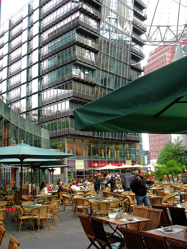
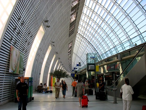
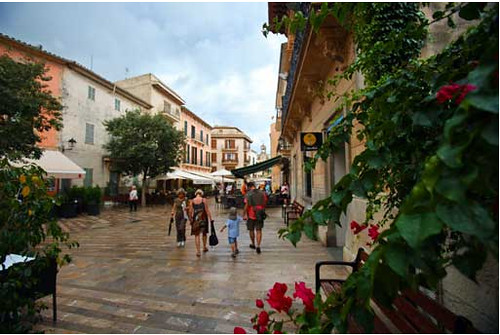
I’m sitting right now in a very modern, slate-gray building designed by Pei Cobb, and I love it, both as the well-functioning and aesthetically pleasing site of my NRDC office (if not for much longer, unfortunately) and as an asset to our downtown neighborhood. I also love (and have mentioned before) Berlin's modernist Sony Center (above left), designed by Helmut Jahn. Cesar Pelli's design for DC's National Airport is just about perfect, as is the Gare d'Avignon TGV (above right) by Jean-Marie Duthilleul and Jean-François Blassel. For me, the issue of design quality is not so much a matter of style as one of scale, suitability to context, respect for nature, and perhaps variety.
Lee begins here:
Recent posts on this blog have speculated on the need to update our definition of smart growth. This is only natural, some thirteen years from its initial articulation, and scores of real, on-the-ground development projects using some of those principles, later. Indeed, this blog has, since its own inception, taken a hard look at a number of these very projects.
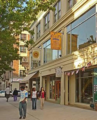 In my view, a “refurbishing” of the smart growth concept would definitely be helpful at this time, as LEED-ND begins to take hold and a whole new generation of development and redevelopment is built. Along those lines, I’d like to posit that one other important element should be added to a set of newer smart growth principles – though I have no illusion that such a proposal will be anything but controversial.
That element is design. I already hear the howls of protest from some of my friends. How can design possibly be integrated into these principles? Isn’t design a matter of art and taste, and who are we – or who is anyone – to impose some kind of artificial standards of taste upon the creative jumble that makes for a great urban experience?
Would design as a smart growth element, for example, remove from the likelihood of construction the aluminum, deconstructionist swoops of a Frank Gehry project, or the clean line of a Rem Koolhaas building? Would it “prohibit” a style, or somehow impose upon the creative process some “artificial” constraint? Would the graceful curve of a Guggenheim Museum somehow be limited or, on the opposite side of the spectrum, how about the brutalist façade of the FBI headquarters in Washington, D.C.?
 Here’s how I see it. Design is part and parcel of city and suburb, whether we acknowledge it or not. It can heavily influence how successful the pedestrian experience is, and indeed, can even influence how well a place works from a sociological perspective:
- increasing personal safety and security with “eyes on the street,” or worsening it with long, blank walls;
- enhancing the shopping experience with easy access, color and movement, or making it less enjoyable with barriers and a drab, uninviting “front porch;”
- contributing to a feeling of comfort, human interaction and well-being with green parks and usable, human-scaled open space, or ignoring those characteristics in favor of windswept, characterless plazas;
- making travel and mobility a pleasant part of the landscape, or forcing pedestrians across multiple lanes of fast-moving traffic or acres of pavement, and making cars into the only means of access to office, business, and home.
In other words, making design an “official” part of smart growth does not mean micro-managing creativity. It does, however, mean that to really qualify as smart growth, development cannot simply meet its efficiency, access, respect for nature, and diversity of use goals (to name a few essential elements). It must also be constructed at a scale, and with the materials and building components that allow it to really welcome people, and to get along with its neighbors. That doesn’t mean it has to look just like them – diversity is good for architecture just as it is good for society and good for ecology – but it does usually need to be something other than a shocking “sculpture,” so unique and artistically precious as to shout: “Look at me. Look how different I am. I am art.”
I use the word “usually” for a reason. There may well be sites and particular uses where the function of having 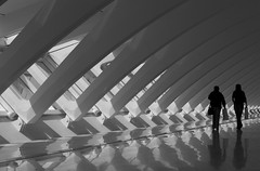 something so utterly different in that place makes perfect sense. Generally, such places and uses are set somewhat apart from the woof and warp of a city’s intimate neighborhoods or great streets: the Sydney Opera House, the Baltimore Inner Harbor’s National Aquarium, the Milwaukee Art Museum. But these functions and these special places surely can be accommodated.
Design really must be addressed in smart growth. Not to do so is to ignore how the aesthetic so influences human experience, and how it affects human feeling and function alike. While articulating good design through local regulation may be difficult, that doesn’t mean it shouldn’t be done – carefully, sensitively, and with an eye toward the main rationale for building: housing human activity in a way that best complements human needs in the context of place and time.
Move your cursor over the images for credit information.
