Diamond in the rough, or a futile attempt to engineer walkability

Posted November 14, 2011 at 5:25PM
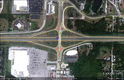
You are looking at something called a “diverging diamond” interchange. Don’t ask me to explain how it works or why it’s called that by civil engineers. This particular one, west of Springfield, Missouri, marks the intersection of two major freeways. And it’s gaining some internet notoriety for its design, which includes either an earnest attempt to create some walkability in a place that is ridiculously unwalkable no matter what you do to it, or a pro forma attempt to comply with new engineering standards regardless of context, depending on how you look at it.
The location is a place as American as apple pie with, starting in the southeast quadrant and going clockwise, a Waffle House and Econo-Lodge; a Walmart Supercenter; and a Lowe’s. (There’s not much going on in the northeast quadrant.)
My pal Chuck Marohn of Strong Towns has started a bit of firestorm by going after the diverging diamond both in concept and in this particular instance. Chuck believes that we need more attention to walkable streets and fewer dollars going into insanely expensive, over-engineered highways. He has some fun with this one, doing an entertaining edit of an video someone sent him to illustrate (with approval) the state’s attempt to engineer the intersection to accommodate pedestrians and cyclists. There is little that Chuck enjoys more than going after his fellow engineers, and he contrasts the unwalkability of the diverging diamond with the true walkability of places like Amsterdam that really do put pedestrians and cyclists first.
The empire struck back, and Chuck apparently got hammered by commenters for going over the top in his comparisons. Did he? Maybe, given that positing a mid-America freeway interchange against central Amsterdam isn’t exactly an apples-to-apples comparison. But Chuck’s response is abundantly fair and (literally) on the money:
“If you watch the original video that my comments were based off of, the gentlemen giving the tour was touting how pedestrian- and cycling- friendly this interchange was. That is absurd. This interchange is not "friendly" to pedestrians or cyclists. Suggestions that red decorative brick or yellow markings on the sidewalks would make it so are absurd.
“If we in the engineering profession can't step back and acknowledge the absurdity of this situation -- the absurdity that mindless adherence to standards has created -- how can we expect to be taken seriously as leaders by a country going through a difficult and painful economic transition?
“It is not good enough to simply follow the ASCE and demand ever more money for our profession when we turn around and waste it in spectacular amounts on things that provide no return (in this instance, moving cars a little faster and building expensive pedestrian/bike facilities that will never be widely used because they are despotic and demeaning). If we want to be part of the solution, we need to reorient ourselves away from our obsession with moving cars more efficiently and towards building places of value.”
Enjoy the video:
Move your cursor over the images for credit information.
