What makes a great city street? Consider these examples

Posted September 6, 2012 at 1:25PM
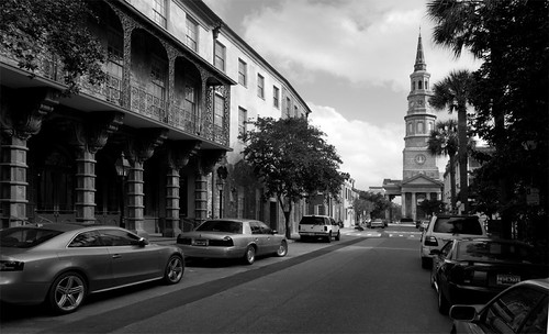
Church Street, Charleston, South Carolina
My friend Victor Dover has taught me more about the importance of streets to community, and the characteristics that can make them great, than I ever might have imagined. I’m still learning, and it’s a fascinating journey. He’s about to share his knowledge with all of us, as he reports that he and his urban compadre John Massengale are writing a book on the subject to be published next year. I don’t know John as well as I know Victor, but he seems to know his stuff, too; this one promises to be a must-have when it comes out.
For the past couple of months, Victor has been hinting at some of what may be in the book through posting a series of “street of the day” photos on his Facebook wall. With his kind permission, I am now able to show some of the images to you. As you view them, consider what’s appealing about each street in the photo, what might be transferable to other communities.
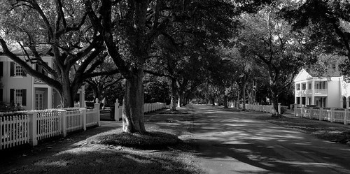
Santa Maria Street, Coral Gables, Florida
Santa Maria Street is sheltered with mature trees. This is vital to facilitate walking in warm climates, and trees also deliver a range of additional sustainability benefits, including absorbing carbon emissions and helping to clean the air. I also like the way the low fencing along this street adds definition to the block while not restricting visual openness.
Note that in the photo of Charleston's Church Street, at the top of the post, there is another approach to providing shade in a warm climate: an arcade. The church at the end of the street also provides what architects call a "terminated vista," or a prominent and appealing visual "anchor" at the end of the street. When you're there, you're in not just a street but a place.
East 70th Street, New York City
New York City presents a vastly different environment than does Charleston or Coral Gables. Here we see the introduction of walkable amenities such as restaurants, and the use of urban landscaping around the buildings to soften the concrete and stone. Metered parking also makes an appearance. We take it for granted, but on-street parking buffers walkers from the flow of traffic, providing them with an additional sense of comfort in a highly urban space. The more comfortable we are walking, the more sustainability and health benefits we can enjoy.
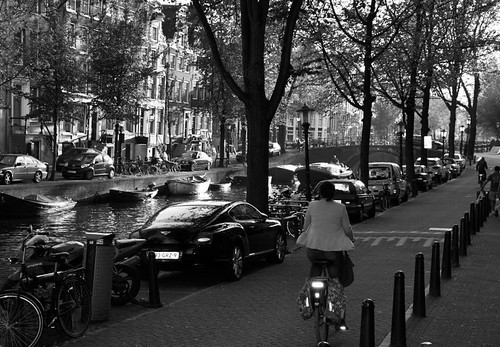
Leidesgracht, Amsterdam
Talk about multi-modal! This street has a canal, bicycling, cars, at least one motor scooter, and space for pedestrians. This makes it a good example of a “complete street” that accommodates different types of users, while still not being so wide as to prevent a sense that one is in a neighborhood, not on a thoroughfare. Victor and I had a conversation last month about the difference between the kinds of streets he prefers and those considered “complete” in current transportation parlance. I came away with a strengthened awareness that a street can be complete in the sense of being multi-modal – no small feat, by the way – but still lack greatness, because of low “walk appeal,” to borrow Steve Mouzon’s phrase. A truly great street will be complete not just in the roadway and sidewalks but also alongside them.
Of the Leidesgracht, Victor notes that “cyclists are not a separate species in Amsterdam.” (For more photos of street life in Amsterdam, go here.)
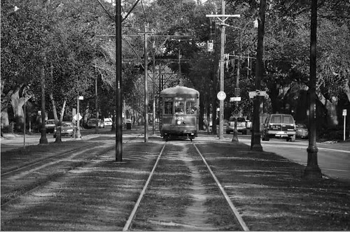
St. Charles Avenue, New Orleans
Speaking of multi-modal, I love the soft, grassy bed for the St. Charles streetcar in New Orleans. This provides not just an additional touch of nature for city dwellers who don’t get enough of it but also green infrastructure for absorbing rainwater and keeping runoff (or at least some of it) out of sewage systems and receiving waterways. This is more common in other parts of the world, and I hope it becomes popular here in the US.
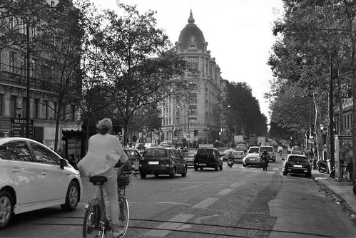
Boulevard Montmartre, Paris
I could walk in Paris for days without stopping.
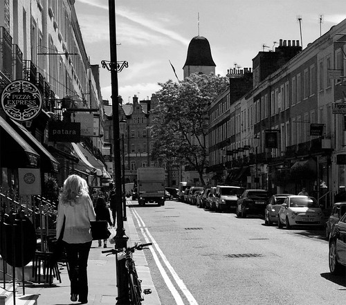
Beauchamp Place, London
Unlike a boulevard in Paris, Beauchamp Place is narrow, with narrow sidewalks, too. But it doesn’t need to accommodate the same high volume of use, and what it does have is an inviting sense of human scale. The buildings are close enough, tall enough and just varied enough to provide a pleasant and interesting walking experience without being so tall as to block light and, for me at least, make the stroll far less appealing. Maybe someone from the UK can post in a comment what the two parallel stripes along the left side of the roadway signify.
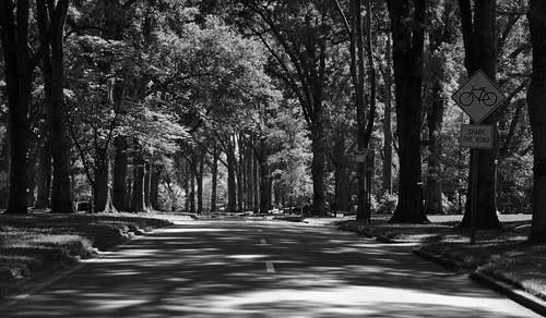
Queens Road, Charlotte, North Carolina
This street in Charlotte’s Myers Park neighborhood is, I believe, a divided roadway with two lanes in each direction separated by a median. It’s a wealthy neighborhood, so some readers might be dismissive of its beauty, but the mature trees (in another warm climate) are awesome.
Victor writes:
“[Noted 19th-century landscape architect] John Nolen's striking Queens Road, Myers Park, Charlotte. How would Nolen have reacted if the DOT said, 'no trees’ or ‘maybe we'll add crepe myrtles [less effective for shade] in a later phase’? The sidewalks are placed behind the trees, not the other way around. Get it, public works department?”
I should note here that Charlotte has been doing some great things lately with transit-oriented development and street design.
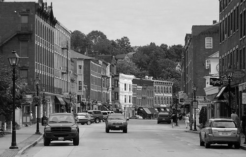
Main Street, Galena, Illinois
Classic 19th-century Americana. Victor notes:
“The superfluous ‘brick accents’ mania is kept to a minimum, the exception being the strip where the lampposts are placed, which is too fussy. But otherwise there are no bulbouts, zebra-stripe marking, or any of the other usual wacky overdone streetscape items.”
My own opinion is that the brick accents are just fine. We all have our preferences, I suppose. But I am glad that the city hasn’t mucked up the street with the other trendy design features Victor mentions. Those things can be useful when the situation calls for it, and if they are designed well. But this small city simply doesn’t need them.
Having previously profiled some of the work of Victor’s architecture and planning firm (including the amazingly forward-thinking comprehensive plan they helped guide for El Paso), I’m betting that Victor and John’s work on street design will be fantastic. I can’t wait to see more.
Related posts:
- Streamlining the process for people-oriented streets (June 26, 2012)
- What's wrong with this picture? Horribly unsafe street design, for starters (March 23, 2012)
- Fixing suburbs with green streets that accommodate everyone (December 20, 2011)
- Connected streets matter, or why Rachel still fears German Shepherds (September 30, 2011)
- Accommodating the multiple purposes of streets (video) (January 28, 2011)
- Giving to the street (for walkability & sustainability) (May 4, 2010)
- Streets for seniors: a video look at issues and remedies (July 1, 2009)
Move your cursor over the images for credit information.
