 Kaid Benfield Archive
 Portland’s shrinking carbon footprint: revitalization and walkable neighborhoods make the difference

Posted September 22, 2008 at 1:34PM
Portland, Oregon has become such a recognized model of progressive planning and development that people like me are actually discouraged from talking about the region in professional circles. "Everybody already knows about Portland," the line goes. I don't think that everybody already knows about Portland's successes, at least outside of the planning profession, so I'm going to keep talking.
The region's achievements have occurred by design. Some of the measures that have been instituted in the last two or three decades include a strong policy favoring infill development and revitalization of downtown neighborhoods, such as the wildly successful Pearl District; an excellent light rail system, supported by transit-oriented development around its stops; 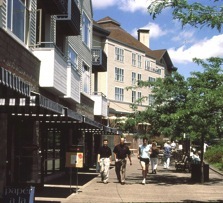 an emphasis on walkability; and protection of forests and farms outside the developed area with an urban growth boundary.
These are all paying off in, among other important measures, reduced global warming emissions. An article in the September New Urban News reports that 2007 CO2 emissions in Portland and Multnomah County were actually slightly lower than they were in 1990, despite an 18 percent population growth during that time span. Single-person auto trips have declined in each of five target areas just since 2004, according to the city's department of transportation. (The article is not online, unfortunately.)
Perhaps most impressively, in 2005, according to the Brookings Institution, the average resident of metro Portland emitted 1.446 tons of carbon dioxide per year though combined road transportation and residential energy use. This is a remarkable 35 percent less than the average resident of America's 100 largest metro areas, which generated 2.24 tons per person per year during the same period.
As is my wont lately, allow me to point you to some maps that illustrate how downtown redevelopment and compact, accessible neighborhoods in Portland deliver for the environment. First, to get you oriented, here's a very standard map of greater Portland. I've "tilted" it slightly off the usual north-south axis so that it will line up a little better with the carbon-footprint maps below it:

Note where the downtown district is, and note that on the other side of the Columbia River to the northeast is Washington state and its city of Vancouver (not to be confused with the more famous Vancouver in British Columbia). Now let's look at the distribution of the residential portion of those carbon emissions. Residential buildings are responsible for a little more than a quarter of the combined amount of CO2 per year in Portland:
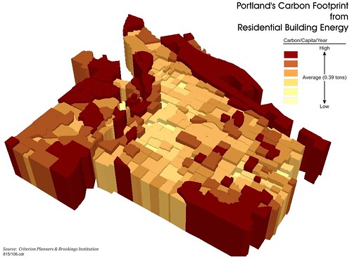
The darkest areas on the nifty three-dimensional graph represent the parts of the region with the highest per capita rate of CO2 emissions; the lightest areas represent the lowest emissions. While the spikes and lows are scattered in places, in general there are more dark, high-emissions areas on the outskirts of the region, more light, low-emissions areas in the middle. This is probably due to more multi-family homes, and smaller single-family homes, both of which have smaller energy needs compared to large single-family houses, in the light-colored neighborhoods.
Transportation, however, represents the lion's share of Portland's emissions, nearly three times as much as residential. And here the pattern is much more clear and pronounced:
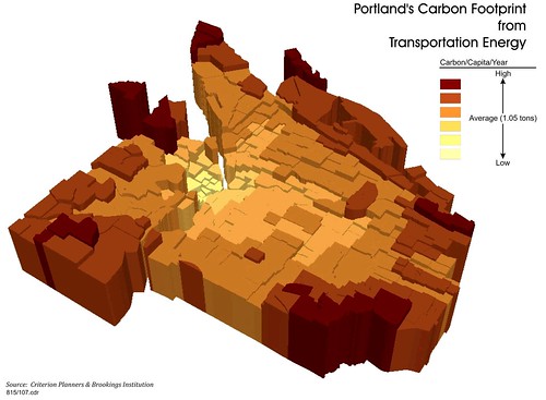
The downtown district and those neighborhoods closest to it have by far the lowest per-capita carbon footprints. That's because residents there don't need to drive as often, and can frequently drive shorter distances when they do. In other words, the graph shows that smart growth policies favoring downtown and infill development work for reducing CO2. Note, by the way, how dramatically the emissions rise just over the river in Washington state, which does not have Portland's policies.
These terrific graphs were produced by NRDC's longtime collaborator, Criterion Planners of Portland.
Don't look for Portland to back off from its successful strategies. They are embedded in the region's local action plan on global warming, according to the New Urban News article, and planners are stressing the benefits of the "20-minute neighborhood," where one can walk to essential amenities and services in 20 minutes.  Criterion has been retained to do the region's greenhouse-gas modeling, and I can vouch that the authorities would be hard put to find better technical assistance.
On the other side of the coin, of course, free-market defenders of sprawling development, "property rights," and an increasingly automobile-dependent lifestyle love to hate Portland. They argue that Portland represents a regression of the American Dream rather than its advancement. But the popularity of the region as a place to live belies their argument. Before the collapse of the national housing market, the same naysayers even cited high home prices as evidence that Portland's smart growth measures have a dark side (as if more sprawling places like San Diego didn't also have high housing prices), and they love to argue that Portland's claims of success in reducing carbon and air pollution emissions are exaggerated.
That argument is getting tougher for them to make every day.