Dramatic new maps of CO2 emissions per household

Posted May 27, 2009 at 2:00PM
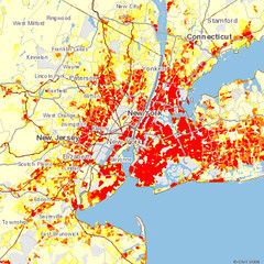
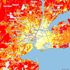
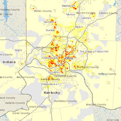
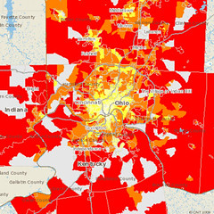
The Center for Neighborhood Technology is releasing today a new series of GIS-based maps showing where carbon emissions from driving are the highest in the nation's metro areas. The maps demonstrate vividly that, although emissions on a per-acre basis are greatest in highly urban areas, it is in the suburbs and outlying areas where we pollute the most on a per-household basis. This is because rates of driving are so much higher in spread-out suburbia than in places where homes, jobs, shops, and services are in more convenient proximity to each other.
Above left, for example, is the Tri-State area including and around New York City. The map on the left shows that the areas with the highest emissions, in red, are those that are most heavily populated. That much should not be surprising. But the map changes dramatically when carbon emissions are plotted on a per-household basis, as shown on the right. It is essentially a reversed image of the map on the left, showing that the most populated areas actually have the lowest pollution rates per household.
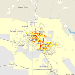
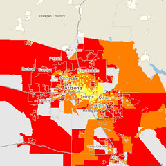
The differences show up even more dramatically in the sprawling Phoenix region:
CNT is a longtime collaborator with NRDC and many other organizations, and their GIS work is superb. I have previously written about their excellent work on the geography of home affordability (for example, here and here) and have cited an early prototype of the CO2 mapping in a post about per-capita thinking in environmental impacts management.
Transportation accounts for 28 percent of all US greenhouse gases, according to CNT, and I believe it accounts for an even higher portion of carbon dioxide emissions specifically. According to CNT president Scott Bernstein:
"Cities are more location-efficient - meaning key destinations are closer to where people live and work They require less time, money, fuel and greenhouse gas emissions for residents to meet their everyday travel needs. People can walk, bike, car-share, take public transit. So residents of cities and compact communities generate less CO2 per household than people who live in more dispersed communities, like many suburbs and outlying areas.
"If you're deciding where to live, consider moving to an urban area. You'll help fight global warming by emitting less CO2. And you're likely to drive less, so you'll spend less on transportation, saving up to $5,000 annually."
I would add that the emissions savings come not only from a greater array of transportation mode choices but also from the shorter driving distances that are taken in more accessible locations. And, in addition to cities, the traditional centers of well-established suburbs also can exhibit favorable per-household emissions profiles. This is illustrated in the maps below of metro Cincinnati, where I was last week:
The carbon maps are part of CNT's larger Housing +Transportation Affordability Index, which includes geographic data and mapping on housing costs, transportation costs, gasoline prices, and various customized variations thereof. You can currently access the CO2 maps for 55 US metropolitan regions, and zoom in on particular neighborhoods or local communities if you like. Later this year CNT expects to have 330 metro areas mapped on its site.
