The geography of persistent unemployment contains some surprises

Posted February 1, 2012 at 12:00PM
A bad economy hurts sustainability, in part because sustainability requires new approaches that must be funded, frequently with money from investors able and willing to take chances, or from local governments whose revenues are tied to declining property values or spending.
I suppose a saving grace may be in the case of real estate development. This persistent economic slump has hurt sprawl worse than it has hurt smart growth: the market for close-in living is clearly stronger than the market for living on the fringe, and that pattern holds for commercial development as well. Changing demographics will likely ensure that the trend toward a preference for more urban environments remains even if we have a full economic recovery.
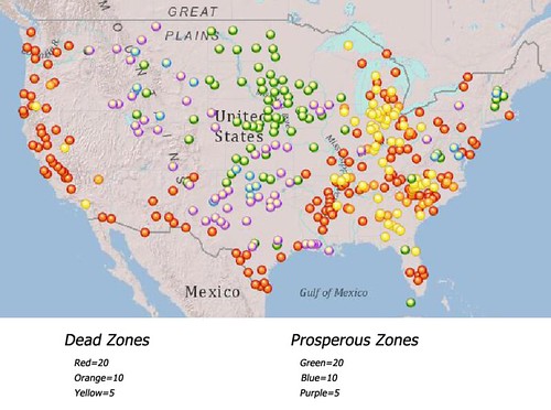
But, in any case, the economic slump is not distributed evenly across the country. And, in some places, it’s a lot more than just a slump. Take a look at this map:
The areas marked in red are those where unemployment has remained at least two points worse than the national average for 20 years or more. Those marked in green are those where unemployment has been at least two points better (i.e., lower) than the national average for 20 years or more. The other color-coding is indicated according to the length of time that a particular area has had unemployment significantly above or below the national average.
Surprised? I was. Louis Ferleger, the author of the map, writes on AlterNet that there may be little to no recovery in places of persistent high unemployment:
“There are 216 defined metropolitan (metro) and micropolitan (micro) areas—with populations ranging from 10,000 to 4 million—that have had unemployment rates at least two percentage points higher than the national average for either 20, 10, or 5 years. These are America’s dead zones. Here employment growth is stagnant or non-existent and high levels of joblessness dominate. Some areas were once prosperous while others have recently experienced economic distress. In these communities paid work is hard to find for those who have not given up looking, and widespread involuntary idleness is the norm.
“Poor employment prospects are not related to periods of recession or prosperity; these communities have not had substantial and sustainable increases in employment for lengthy stretches. America’s dead zones cannot be described as containing ‘weak labor markets’ because many have had long term unemployment problems that are more than weak and not temporary. Even in zones with only 5 years of high unemployment, the prior years were hardly marked by robust job growth.”
Ferleger observes that the “dead zones” of persistent high unemployment seem to be evenly distributed throughout the US except for the Upper Midwest and New England. Meanwhile, the “prosperous zones” are “almost entirely comprised of the Upper Midwest down to Northern Texas and New Mexico.” He suggests that the low levels of unemployment in the Upper Midwest may be explained by low population levels, and therefore a low supply in the labor market. He also notes that prosperous zones tend to be defined by a single strong dominant industry.
Ferlenger concedes that the labeling of the zones, based on sometimes large metro areas, can mask intra-regional differences that can be significant.
To be honest, I’m not entirely sure what all this means for the recovery of cities, especially with respect to the more urban parts of cities and regions. One quite possible outcome might be that the differences we are seeing in home values and other market indicators with regard to the ascendance of urbanism over sprawl may be even more pronounced in weak-economy regions. It may be in the “prosperous zones” where there remains a stronger market for suburbia, because city locations can’t build fast enough to meet demand, making them less affordable (or perhaps only seemingly so, if you also consider transportation costs).
The map may also suggest where green there is both a need and a ready labor market for green jobs in clean energy and other environmentally-friendly industry.
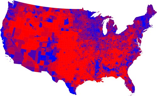
In any event, I was also struck by how the unemployment map compared to the red/blue political map from the 2008 election. It's far from a perfect match, but there is a lot of blue in the "dead zones."
Read all of Ferlenger’s analysis, some of which seems counterintuitive to me, here. His article contains tables listing the regions in the various categories.
Move your cursor over the images for credit information.
Please also visit NRDC’s Sustainable Communities Video Channel.

