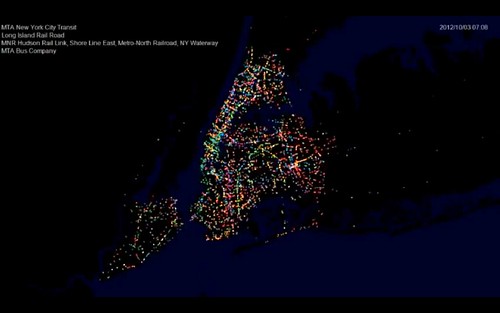
The fascinating visual rhythms of regional transit

Posted December 6, 2012 at 1:30PM
If you are interested in transit maps and abstract kinetic art (maybe that’s a small confluence of people?), this may be for you. I pretty much love it.
The videos, which come from the STLTransit channel on YouTube, track the movement of transit vehicles in various cities throughout a 24-hour day, generally from 3 or 4am until the next 3 or 4am, and display the action in exactly two minutes and 24 seconds each. Many are color-coded for different types of vehicles (some show ferries as well as buses and trains) and you can either just enjoy the patterns, which are mostly set to music, or watch closely to see the changes in activity in a region over the course of the day. The one for New York looks like holiday lights in motion.
New York City:
San Francisco:
Washington:
Vancouver:
Los Angeles:
Chicago:
The videos were created by the software development firm Sumus. Their YouTube site explains:
“This channel presents movies related to public transit, in particular movies of transit activity. These movies are created from General Transit Feed Specification (GTFS) data made available by numerous transit authorities.
“The movies are based on timetable schedules, where each point represents one vehicle. The colors used are part of the GTFS data, and where they are not specified default to white. In some cases specified colors may be changed to ensure sufficient contrast.”
The STLTransit channel includes lots more from additional cities. While you’re at it, check out NRDC’s own sustainable communities video channels on YouTube (180 videos and growing) and Vimeo (69 videos and growing). Lots of good stuff on each.
Related posts:
- Wow: animating the city with amazing, kinetic LEDs (November 30, 2012)
- Public transit is for everyone, dogs too (August 13, 2012)
- Where the bike commuters are, mapped & analyzed (August 10, 2012)
- How walkable, transit-oriented neighborhoods help seniors (June 5, 2012)
- Impressive Denver study on equity & transit should become national model (May 4, 2012)
- New data show how transit corridors reduce traffic, increase walking (August 17, 2011)
- Interactive map shows where Americans are moving (March 30, 2011)
Move your cursor over the images for credit information.
Please also visit NRDC’s sustainable communities video channels.
